Graph and Chart Manager
In the Graph and Chart tool, Global Mapper can produce various types of
charts and graphs from the loaded data, for example:
- a bar graph of the population for each country on a map,
- a pie chart comparing the total value of different types of land parcels,
- a line graph that shows the change in elevation over time for GPS waypoints,
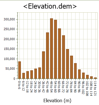
- a histogram summarizing the elevations
in a grid.
Once a graph is defined, Global Mapper stores the definition in the workspace associated with the data. The graph or chart can be embedded in a map to be printed or displayed onscreen in a panel.
To create a new graph, select the Graph and Chart
Manager... option on the Tools
Menu. Once a new graph is created, the open graph window may be docked or floating. For more information on docking, see Window Docking.
Create a New Graph
To create a new graph, perform the following steps:
-
Load elevation data or vector data containing attributes to be graphed. See Joining a Table if necessary to add additional attributes to the vector data.
Note: To create a histogram from raster data, go to layer Metadata
Note: To create a graph of multiple attributes for a single feature, access the graph tool from the Feature Info Tool
Note: If you plan to use multiple layers of data in the graph, each layer should have a unique identifying name. Once a graph is created that uses the layer name, the layers should not be renamed in the control center.
-
To create a new graph select the Graph and Chart Manager from the Analysis menu. Then press the New... button to create a new graph.
-
On the General tab, enter a Title for the graph.
-
On the Data Series tab, select the type of graph. The available options include: Bar Graph, Bar Graph - Horizontal, Histogram, Line Graph, and Pie Chart.
-
Use the Source Data ... button to choose the layer(s) that contain the data to be graphed.
-
Specify the Point Label Attribute. This is the main grouping or categorization of the data, and is the x-axis on most of the graph types.
-
Specify the Value Attribute. This is typically a numeric attribute and can be aggregated by Sum, Average, or Count.
-
For a basic graph, this is all the information that is needed. To use the Multiple Series Attribute to create a graph with a second level of grouping that shows in the legend, see more details below.
-
Finish the graph by setting up the styling for Data Labels, axis and legend labels, and other coloring and text settings.
-
Press OK to load the graph into a new window. From here it can be modified or saved to an image. It can be closed and reopened from the Graph and Chart Manager.
Graph
and Chart Manager
The Graph and Chart Manager (pictured below) shows a list of the graphs defined in the current workspace. It can be used to view or modify them or to create a new graph.
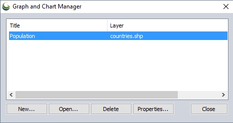
The Graph and Chart Manager window contains the following:
The list contains the title and data layer for each graph in the current workspace. Click on an entry in the list to select it. Only one entry can be selected at a time.
| New... | Click this button to open the Graph Properties window to define a new graph. |
|---|---|
| Open... | Click this button to display the selected graph in the Graph window. This button will be disabled until the user selects a graph in the list. |
| Delete | Click the Delete button to remove the selected graph from the list and from the current workspace. This button will be disabled until the user selects a graph in the list. |
| Properties... | Click this button to open the Graph Properties window initialized with information from the selected graph definition so that it can be edited. This button will be disabled until the user selects a graph in the list. |
| Close | Click this button to close the Graph and Chart Manager window. |
Graph
Properties Window
The Graph
Properties Window displays the map information and options associated
with a graph definition, and a preview of the graph. This window can be
used to create a new graph and edit an existing graph definition. As the
user changes options (data layer, attributes, style, etc.) the preview
will be updated.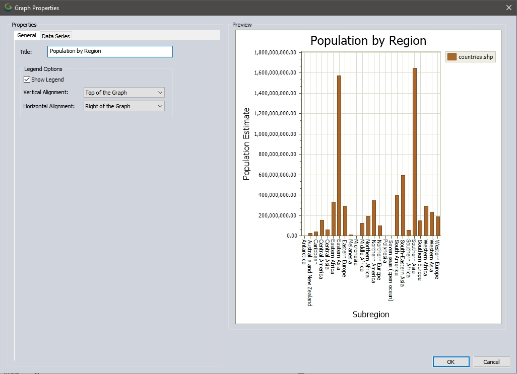
The Graph Properties window contains the following elements:
General Tab
When the user clicks on the tab marked "General", the following
screen will be displayed: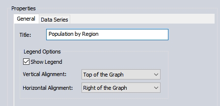
The General Tab contains the following information that applies to the graph as a whole:
Title
- This is the main
title for the graph and is used to identify the graph on the Graph and
Chart Manager screen. Type the graph title in the associated textbox.
As the data is typed into the box, the graph preview will be updated
to reflect the change.
Show
Legend - Put a
check in this box to add a legend to the graph. When the box is
clicked, the graph preview will be updated to show or hide the legend,
depending on whether the box is checked or unchecked, respectively. Use
the Data Series tab to specify the contents of the legend.
Vertical
Alignment - Choose
an option from this list to specify the vertical component of the legend's
location. The legend can be:
- Above the Graph, Top of the Graph, Middle of the Graph, Bottom of the Graph, Below the Graph
Horizontal
Alignment - Choose
an option from this list to specify the horizontal component of the legend's
location. The legend can be:
- Right of the Graph, Right Side of the Graph, Center of the Graph, Left Side of the Graph, Left of the Graph
When the user makes a selection,
the legend on the preview will be moved to reflect the choice.
Data Series Tab
This tab contains the definition of the type of graph and data to be used. When a choice is made for the graph data or style, the preview to the right will be updated to reflect that choice.
Type of Graph
Global Mapper can create the following types of graphs:
| Bar Chart | A bar graph can be created from attribute data in a vector layer or a Lidar data set. The data values in the attribute will be summarized based on the point label attribute. The X-axis will show the categories from the point labels, and the height of the bar represents the sum, average, or count for each category. | 
|
|---|---|---|
| Bar Chart - Horizontal | A horizontal bar graph is similar to a bar graph except that the Y-axis shows the categories, and the length of the bar represents the sum for each category. | 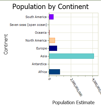
|
| Histogram | Global Mapper can create a histogram from a
Lidar data set, an attribute associated with a vector layer, or an elevation
grid. When the input data is a Lidar data set or vector layer, Global
Mapper will count the instances of each value associated with the attribute
being graphed, then group those values into bins. Each bin will
be a bar in the graph. If the value data is character data instead
of numeric, then the graph will contain a bar for each value. When the data is an elevation layer, the elevation values will be grouped into bins, and each bin will be a bar in the graph. Note: To generate a histogram from raster data, go to the layer Metadata. |
|
| Line Graph | A line graph shows the change in the value attribute compared to the Point Label Attribute. Typically the point label attribute would capture an element of time, such as a timestamp. With multiple layers selected, the X-Axis can also contain the layer name by using the <Feature Layer Name> option. With the Multiple Series Attribute option enabled, the graph will contain multiple lines, split based on the selected attribute. | 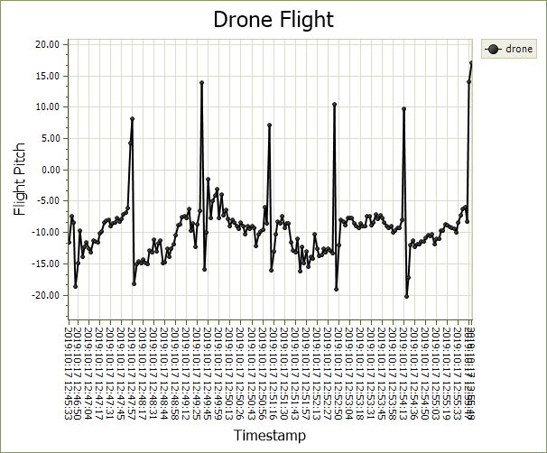
|
| Pie Chart | Global Mapper can create a pie chart from attribute data in a vector layer or a Lidar data set. The data values in the attribute will be summed up based on the category attribute. The size of each pie section will represent the percentage of the total for the associated category. | 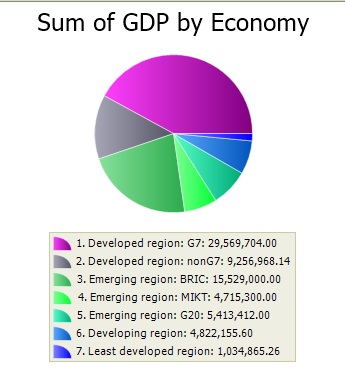
|
Data Settings
Click the Data Series tab to display the following
window: 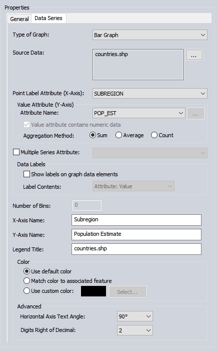
The Data Series tab contains the
following that applies to the data in the graph:
Source Data - Choose the data layer or layers that will be used to generate the graph. The list will contain only layers that are suitable for the currently selected graph type. If the type is Histogram, then elevation layers, Lidar layers, and vector layers will be in the list. For all other graph types, the list will contain only Lidar data sets and vector layers. When a choice is made, the preview will be updated to reflect that choice.
Note: To see a histogram of raster data, go to the layer Metadata
Point
Label Attribute (X-Axis)- Choose
the vector layer attribute that will provide the main categorization
graph. This attribute value will be used to group multiple
features into a single bar or pie section and as the X-axis in a line graph. When a choice is made, the preview will be updated to reflect that
choice. If the user has selected
an elevation layer for the source layer, this list will be disabled. The <None> option will do no grouping of features by attribute, and each feature will be graphed separately. With <None>, features are labeled based on their assigned label or index value.
When multiple layers are selected in source data, the point label may be set to <Feature Layer Name>. This will group the features by layer name.
Value Attribute (Y-Axis)
Attribute Name - Choose the attribute used to provide values for the graph. If the user has selected an elevation layer for the source layer, this list will be disabled. When a choice is made, the preview will be updated to reflect that choice.
Value attribute contains numeric data - Put a check in this box if the data in the value attribute is numeric. This box will only be enabled when the graph type is Histogram. In all other cases, the value attribute must contain numeric data, so this item will be checked and disabled.
Aggregation Method - This defines how the Point Label aggregates the values (Value attribute). The options are Sum, Average, or Count. For example in the sample above of Population by Region, population is summed by region. Choosing Average would give the average population of the countries in each region. Count would provide the number of countries that contain a value for population. Features with empty / null values would not be included in the count.
Multiple Series Attribute - The series attribute is an additional level of categorization that can be applied to bar graphs or line graphs. This will show in the legend. In a line graph, adding a series attribute will divide the graph into multiple lines, one for each unique attribute within the series. In a bar chart or horizontal bar chart a series attribute will provide an additional subdivision within the Point Label Attribute
Show labels on graph data elements - Check the box to enable the data labels to be displayed. This item will be disabled until the user has selected the graph type and data layer. The preview will be updated when this option is clicked.
Label Contents - Choose an option that determines what data will be included in the label. This text box is attached to distinct data elements inside of the graph. Choices are: Attribute and Value, Value and Attribute, Attribute, Value.
Attribute refers to the value associated with the attribute in the X Point Label Attribute field. Value refers to the number used to determine the length of the bar, size of the pie section, etc. This item will be disabled when the check box used to show labels is not checked. When a choice is made, the preview will be updated to reflect that choice.
Number of Bins - Type in the number of bins to be used in a Histogram. If the graph type is anything other than Histogram, this field will be disabled. The preview will be updated when a value has been entered and the user releases focus from this field by tabbing to or clicking on another field.
X-Axis
Name - Type the
name to be displayed along the X-axis. The preview will be updated
as the data is typed in.
Y-Axis
Name - Type the
name to be displayed along the Y-axis. The preview will be updated
as the data is typed in.
Legend
Title - Type
the title to be used for this data series in the legend. The preview
will be updated as the title is typed in.
Color section - Use the radio buttons in this section to choose the color scheme for the graph.
Use default color - Check this radio button to allow Global Mapper to choose the data series color. The preview will be updated when this selection is made.
Match color to associated feature - Check this radio button to match each graph element's color to its associated feature. This option will be disabled if the graph type is Histogram. The preview will be updated when this selection is made.
Use custom color - Check this radio button to choose a color to be used for the data series. The preview will be updated when this selection is made.
Select... - Click this button to display a color selection dialog. Once the selection has been made, the rectangle to the left of the button will be updated with the selected color, and the preview will also be updated.
Advanced - Choose Horizontal angle
for graph text and the number of digits right of decimal for numeric values.
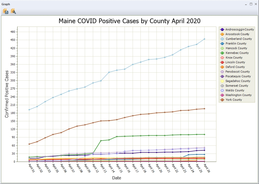
Graph
Window
When a new graph is first created it will automatically open in a new graph window. A graph can also be opened by highlighting the name in the Graph and Chart Manager and pressing the Open... button. The Graph window contains the graph
and buttons to modify or save the data. This window can be floating or docked into the application. See Window Docking for more information.
 Save and Add to Map - Selects the location where the image file will be stored and the type as BMP, JPEG or PNG. The Fixed Screen Location dialog will then control
where it should be located on the map and how large the image should be.
For more information on the Fixed Screen Location Dialog, see Open Data
File at Fixed Screen Location.
Save and Add to Map - Selects the location where the image file will be stored and the type as BMP, JPEG or PNG. The Fixed Screen Location dialog will then control
where it should be located on the map and how large the image should be.
For more information on the Fixed Screen Location Dialog, see Open Data
File at Fixed Screen Location.
 Properties - Press the Properties button to change the setup of the graph.
Feature Info Graphs
When the Feature
Info Toolis used to select a pixel, a Pixel Information dialog
displays the following information in either a line or bar graph:
- Layer name
- Pixel coordinates
- Ground coordinates
- Band values
- Slope and Slope Aspect (elevation grid only)
Graph of band values
Layer - This field contains the
description of the layer that contains the pixel.
Location - Displays the coordinates
of the pixel in the global projection.
Row, Column - contains the pixel
location within the raster image. If the raster is an elevation
grid, there is also an Elevation
field that contains the elevation, slope, and slope direction at the selected
pixel.
Graph Type
- This field allows the user to choose to display the graph as a bar graph
or line graph.
Bands - This section contains
a list of the values for each band in the pixel. The bands designated
as red, green, and blue will be labeled as such, and the other bands will
be labeled as “Band n”. If the user clicks on one of the lines in
the Bands list, the corresponding graph bar or point will be highlighted.
Graph - This section contains the graph itself and the Show point labels check box, which permits the user to show or hide the labels that are above each bar or point in the graph.
If the graph contains a large number of points, the view area will be narrowed to a portion of the graph, scroll to see the rest. Check Fit data to graph to fit the entire extent into the window. When the box is checked, all of the data will be displayed in the graph window. When the box is not checked, the view will contain a portion of the graph, and the user will be able to scroll left and right to see the rest. In this case, all of the labels will be displayed.
Graph of Multiple Attributes
Use the Feature Info Tool to generate graphs related to only the selected feature. The graph button will open a custom version of the Graph and Chart manager related to graphs of individual features.
When graphing an individual feature, it is possible to add multiple attributes. Press the button next to the attribute name to select multiple attributes to include as the value attribute.
The Point Label will show below the title. This graph setup is a template that can be regenerated for each selected feature.

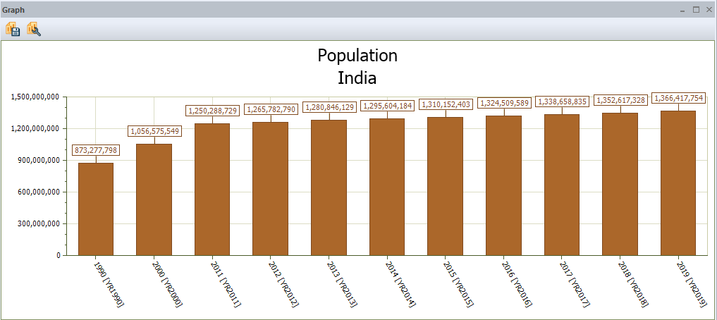
In the case above, the selected feature was China, but now that a Population graph has been created, the same graph template can be used for another feature by selecting that feature with the Info Tool and going to Graphs, then opening the population graph.